This study investigates the usability of the Capeet Concert App, aims to provide an accessible and user-friendly overview of upcoming concerts while also enabling community interaction through forum features and tools for planning band-related activities.The purpose of this study is to evaluate whether the app allows users to easily find relevant events, understand and use the forum, and whether it offers a more usable and satisfying experience compared to the existing Capeet website.
2. Heuristic Evaluation
Before conducting the usability tests, a heuristic evaluation was performed based on Nielsen’s usability heuristics. The evaluation was carried out independently by the team members and subsequently consolidated into a combined set of findings. Identified issues were rated by severity on a scale from 1 (minor) to 3 (major).
The evaluation revealed several high-severity usability issues, particularly related to accessibility and visual clarity, such as insufficient contrast, small font sizes, and limited touch target areas. Additional issues affected system feedback and error prevention, including missing loading indicators, unclear confirmation dialogs, and a lack of undo options for critical actions. Lower-severity issues were related to visual hierarchy and information structure on profile screens.
Table 1: Combined findings
Teammates
Problem Description
Heuristic #
Severity
Prithaa, Helena
Dialog to confirm actions like delete and edit, snack bar
1
2
Prithaa
Contrast needs to be increased
8
3
Helena
Increase Font size, min 16dp
8
3
Prithaa
No loading screens or anything when switching screens
1
2
Helena
Touch area of labels/filters too small in EventsScreen
2
3
Helena
ProfileScreen: Info should not be editable directly
(two textfields); an edit button should redirect to edit form.
4
3
Helena
Clearer separation of own info and following (visual hierarchy should be taken
into account)
1
1
Prithaa, Helena
No button indicating that you can undo an action (e.g., accidental create event)
3
3
Helena
Simplified error message at login
9
2
3. User Study
The goal of this usability study was to evaluate whether users can efficiently find concert information, understand and interact with the forum, and whether the Capeet Concert App offers a more usable and satisfying experience compared to the existing Capeet website. The study addressed three main research questions: the findability of upcoming events, users’ comprehension of the forum’s purpose and interaction model, and the perceived ease of use when comparing the app to the website.
The independent variable of the study was the platform used (Capeet App vs. Website), while the dependent variables included findability, understanding/comprehension, ease of use, and user satisfaction. Data was collected using a within-subject design, allowing each participant to interact with both platforms.
Both quantitative and qualitative data were gathered. Quantitative measures included task completion rates, Single Ease Question (SEQ) ratings after each task, and an overall System Usability Scale (SUS) score. Qualitative data was collected through think-aloud comments during task execution and open-ended feedback at the end of the session, providing deeper insight into user expectations, confusion points, and positive experiences.
The study was split in two parts, the first one consisted of a second Heuristic Evaluation done by a Quality Assurance Engineer at the end of the first week, with a first Prototype of the working app. The second Part was a within-subject Evaluation that contained a descriptive research part, focusing on the usability of the app as well as possible improvements, and an experimental question researching the ease of use and satisfaction of users in comparison to the “Capeet” website.
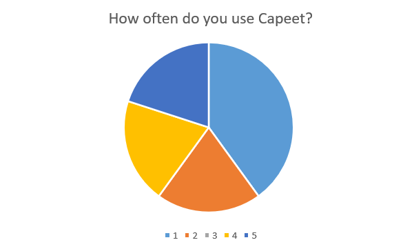
We recruited 5 participants for the within-subject evaluation, who were our friends or acquaintances and between 18 and 24 years old. It was important to us that every participant had an association with or interest in the punk and alternative scene of Austria, which we managed to achieve. Two out of three participants had used the “Capeet” website frequently before.
Participant Usage of Capeet
Figure 2: Frequency of Capeet usage among the 5 participants.(1: Never, 5: Very Often)
3.1 Heuristic Evaluation by an Expert
An expert evaluation was conducted to identify usability issues that were not previously captured by the team. The findings were categorized according to Nielsen’s usability heuristics.
1. Error Prevention: Editing events was faulty, which could lead users to make unintended changes or lose data.
2. System Feedback: Updating events did not work correctly, leaving users uncertain if their actions were successful.
3. Input Validation: There was no minimum character requirement for usernames, allowing empty strings to be submitted and potentially causing errors or confusion.
3.2 Test Protocol
Before the usability test began, participants were informed about the purpose of the study and the context in which it was conducted. Participants were presented with an informed consent form outlining the study procedure, the type of data collected, and their rights as participants. It was clearly communicated that participation was voluntary, that they could withdraw at any time without providing a reason, and that all collected data would be handled anonymously and used solely for academic purposes.
After giving consent, participants were asked to enter a user ID provided by the researcher and to answer a short demographic questionnaire, including age group and self-reported familiarity with the “Capeet” website, the punk/alternative music scene, and local concerts.
Before starting the tasks, participants received a brief explanation of the think-aloud method. They were encouraged to continuously verbalize their thoughts while completing the tasks, or anything they found confusing or particularly easy.
Participants then completed a series of predefined tasks based on a scenario involving interest in alternative music genres and the band La Dispute. Tasks included searching for the band, viewing upcoming events, creating a forum post, and interacting with existing posts. One task required participants to find the exact date of a concert using both the app and the website, with the starting platform (app or website) chosen by us researchers.
After each task, participants rated the perceived difficulty using a Single Ease Question (SEQ) on a 7-point scale. At the end of the session, participants completed the System Usability Scale (SUS) to provide an overall evaluation of the Capeet Concert App. Finally, they were invited to give open qualitative feedback about anything they found confusing, pleasant, or noteworthy during the interaction.
The entire session lasted approximately 15-20 minutes.
3.3 Results
3.3.1 Descriptive Research
All of the first three tasks received consistently very high SEQ ratings and were completed successfully.
Most participants rated these tasks with the maximum score of 7 (Very Easy), indicating that navigation, search functionality, and forum interaction were intuitive and easy to understand. No participant rated any of these tasks below 6 (only once was one task rated 6), suggesting minimal friction during core app interactions.
Overall, the results show that users were able to complete essential content discovery and community-related tasks quickly and confidently.
3.3.2 Experimental Research
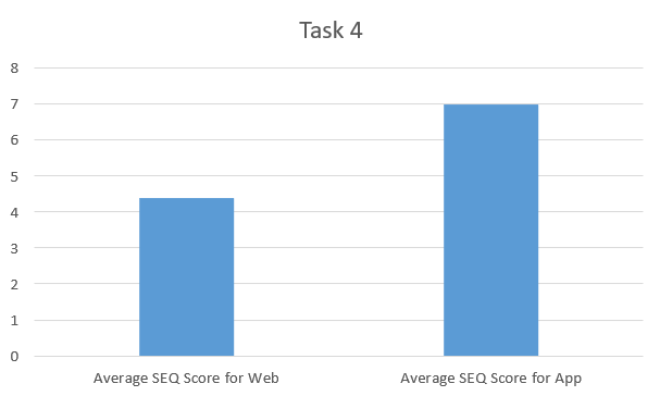
The results from the fourth task showed that: Just like the previous tasks none of these tasks were not completed. The App SEQ scores were consistently higher, with all participants rating the task as very easy (7). The Website SEQ scores were slightly lower, with the average of ratings being 4.4, indicating a moderate level of difficulty.
This comparison suggests that while both platforms allow users to find relevant concert information, the app provides clearer navigation and faster access to event details. Several participants implicitly favored the app by commenting on its improved usability compared to the website.
Figure 3: average SEQ (Single Ease Question) scores for the fourth task.
3.3.3 SUS Scores
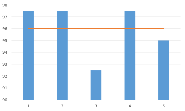
The System Usability Scale (SUS) results could all be read as grade A; individual SUS scores ranged from 92.5 to 97.5. All scores fall well above the industry benchmark of 68, indicating excellent usability. The average SUS score was 96.0.
This score suggests that users found the app highly intuitive, well-integrated, and easy to learn without external support.
Figure 4: SUS score from each participant with the line indicating the average.
3.3.4 Open-ended Feedback
The open-ended feedback and recordings further reinforces the quantitative findings: The app was described as “beautiful,” “user-friendly,” and “much better than the website.”Multiple participants appreciated the forum feature and community interaction. The comparison with the website was generally favorable to the app, with one participant mentioning that the website is mainly appreciated for nostalgia, not usability. Although there were also suggestions for feedback and improvements that we implemented afterwards:
Better UI recognition on the website, that Posts couldn’t be searched, no Cancel button for New Post Page.
We also had to accept one suggestion as not being sustainable to implement, that being adding local posters as pictures for events, because the website did not provide any pictures and we would have to search and upload posters ourselves each time.
Overall, the feedback suggests that while small content or feature improvements are possible, the core design and interaction model of the app are very well received.